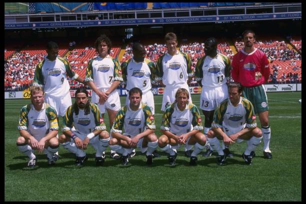
5 MAy 1996: Colorado Rapids Team photo taken before an MLS game against the Kansas City Wiz played at Mile High Stadium in Denver, Colorado. The Rapids won the game, 4-0. Mandatory Credit: Jed Jacobsohn /Allsport
Commerce City, CO – The Colorado Rapids are launching a much anticipated third kit along other MLS original clubs to celebrate the league’s 30th season. The original post suggests that the jersey will return the Rapids to their original green and white look, which they wore from 1996 to 2000. The kit will launch next Wednesday when the club plays at Seattle Sounders.
With this, there seems to be no better time to take a trip down memory lane and reminisce on all the Rapids branding over the past 30 years since the announcement of MLS.
Being a part of the ten teams that started MLS, the Rapids had to come out of the gates strong with a look that the people of Colorado could get behind. They decided on a green and white color combination for the kits and a badge that featured the team name, along with a mountain and actual rapids, to tie it all together.
The home and away kits during this period largely retained a similar core theme. The home kit is white with green accents, while the away kit features a predominantly green design with black accents. In the early years, Rapids jerseys stayed true to this look, but switched for the 2001 and 2002 seasons, where the home kit was all green, with the away kit retaining the all-white design.
Rapids All Green Jersey and Logo. Image by Spencer Baldwin
Most of the early jerseys during this time had the logo or a similar symbol in the middle of the player’s chest, where a sponsor would normally reside on today’s kits. It had a secondary logo in place of the main one, which bore some distinct similarities to the logo the Rapids adopted in the 2003 season.
Despite a rough start to life in MLS, this jersey and logo combination had some success and iconic moments. Getting to the MLS Cup final in 1997 and then the U.S. Open Cup final two years later in 1999. Who can forget the Marcelo Balboa bicycle kick Goal of the Year in the 2000 edition of the green and white strips?
The green and white were the original colors of the Colorado Rapids, and, along with the logo, remained in use until the 2002 season. After that 2002 season, the Rapids underwent their first of two rebrands to date.
Early 2000s Black and Blue
Rapids Early 2000s Black and Blue Jersey and Logo. Image by Spencer Baldwin
The 2003 season was a complete rebrand for the Rapids. New logo and colors, but luckily keeping the Rapids name. The Rapids opted for a more soccer-looking logo with this rebrand. Sporting a circle design with Colorado Rapids along the edges, and a soccer ball front and center of the logo.
The logo retained the green from the inaugural kits, but the jerseys switched to black and blue vertical stripes for the home look and an all-white look for the away kits. Later editions of the kit featured a splash of black, but retained a similar core theme until the subsequent rebrand. These new waves of jerseys kept a similar template in terms of logo placement. They featured the Colorado Rapids branding along the chest and now had the official logo in the usual location.
It’s difficult to look at the black and blue or the later versions of the all-green look without thinking of players like John Spencer or Chris Henderson. While this period did not yield any final appearances, the Rapids did not miss the playoffs while wearing the black and blue.
2005 was the first year that the Adidas logo was featured on the jersey, a logo that has stayed on every Rapids kit since then. From bouncing around sponsors like Puma, Kappa, and Athletica on the early renditions of the jersey, the Rapids finally found a long-term partner for the manufacturing of their kit.
The black and blue Rapids brand was the shortest of the three so far, with the team rocking the combination for four years from the start of the 2003 season to the end of the 2006 season. Nine years later, Colorado Springs Switchbacks would adopt black and blue as their colors. Coincidence? Big things were coming up for the Rapids, and they decided that it was time for a new look in Colorado.
Burgundy and Blue
Colorado Rapids 2010 Home Jersey and Logo. Image by Spencer Baldwin
Coinciding with the opening of their new soccer-specific stadium that the Rapids still call home, DICK’s Sporting Goods Park, the club decided to switch to the burgundy and blue look that they have today. Opened for the 2007 season, DICK’s Sporting Goods Park was a massive step in the right direction for the Rapids organization, giving the team and the state a soccer-specific stadium.
The Rapids lost the stripes look with their new jerseys, opting for a more minimal look. The home kit was all burgundy with the classic Adidas stripes on the shoulders being sky blue. The word Rapids featured on the kit along the chest. The away jersey shared the same template but was entirely sky blue and featured burgundy shoulder stripes. The away kit sported the word Colorado along the chest. This look remained until 2009, when the words on the chest were dropped, but they kept the same look.
Along with the new colors, the Rapids switched from the previous logo and adopted the logo that looks awfully similar to the one today (only missing the star that was adopted for the 2012 season onward). The shape changed dramatically from the circular design of the past to one that more easily resembles a diamond. The soccer ball stayed, but wasn’t in the spotlight anymore. Now the name of the team and the mountain range accompanied the ball, and created one of, if not the best, logos in the league.
It was this logo and color combination that the Rapids wore during their 2010 MLS Cup-winning season. It took until 2012 for the Rapids to add the star (they had the MLS Cup trophy scudetto patch in 2011), but the collar on the burgundy and blue home jersey will forever be immortalized.
While the primary logo has remained relatively unchanged since 2007, the jerseys have undergone a wild journey, especially the away strips. The first change occurred in 2011, when the home kit remained the same, but the away kit was updated to white with burgundy shoulders. It is hard to see this look without thinking of Martin Rivero for whatever reason.
2013-2018 is when the Rapids started to get really creative with the colors used on the away jerseys. The home one remained burgundy but adopted white shoulders and shorts, a look they kept until 2018. The change was minor compared to the away kits, ditching the usual white away kits. We were introduced to the all-blue away strips in 2013, with hints of yellow and red throughout. It was inspired by the Colorado state flag. The club caught the front of the wave of state flag merch and branding. The 2015 edition kept the same colors, but was primarily yellow. The 2017 look was similar but added blue on the shoulders. This was an era that you either loved or hated for the Rapids.
Rapids 2018 Home and Rapids 2016 Away Jerseys. Image by Spencer Baldwin
After the Rapids returned to their burgundy and blue home look, their away kits reverted to being white or a very faint shade of white. In the current era, the club has crushed it with secondary kit designs and initiatives behind them. In 2021-22, there was the Class Five kit and the partnership with Colorado Fourteeners Initiative to promote nature conservation. Then in 2023-24, they had the New Day kit promoting mental wellness. 2023 also coincided with the Rapids’ home look featuring all burgundy, head to toe. Chef’s kiss.
It is a year of firsts for the Rapids in terms of branding, as they have released their first Rapids third kit since 2008 (who remembers the white with the red line), which will be unveiled this month, and also introduced their first secondary logo, which appears on the Headwaters kit. The logo is alongside the recent trend of rebranding a team to a more minimalist one, which works for me as long as it remains the secondary logo.
Rapids 2025 Secondary Jersey and Logo. Image by Spencer Baldwin
The Rapids have gone through the process of starting a team from scratch, two complete rebrands, and numerous different away looks throughout the thirty years since the league’s inception. Landing on and sticking with the burgundy and blue look, the Rapids have been able to create a recognizable brand within the state of Colorado and the league that was just trying to stay alive a few decades ago. The history of the Rapids brand is an interesting one, and the new third kit is a great way to celebrate 30 years of Rapids soccer!
Football Kit Archives has a great timeline of all the kits, training tops, and goalkeeper drip worn in club history.
Photo Credit: Jed Jacobsohn/Allsport via Getty Images
Thank you for reading Burgundy Wave. Support us via our Patreon starting at $5/month. We’re always looking for new talent. Let us know if you’re interested in covering Colorado Soccer.
{"id":"299","mode":"form","open_style":"in_place","currency_code":"USD","currency_symbol":"$","currency_type":"decimal","blank_flag_url":"https:\/\/burgundywave.com\/wp-content\/plugins\/tip-jar-wp\/\/assets\/images\/flags\/blank.gif","flag_sprite_url":"https:\/\/burgundywave.com\/wp-content\/plugins\/tip-jar-wp\/\/assets\/images\/flags\/flags.png","default_amount":5,"top_media_type":"none","featured_image_url":false,"featured_embed":"","header_media":null,"file_download_attachment_data":null,"recurring_options_enabled":true,"recurring_options":{"never":{"selected":true,"after_output":"One time only"},"weekly":{"selected":false,"after_output":"Every week"},"monthly":{"selected":false,"after_output":"Every month"},"yearly":{"selected":false,"after_output":"Every year"}},"strings":{"current_user_email":"","current_user_name":"","link_text":"Leave a tip","complete_payment_button_error_text":"Check info and try again","payment_verb":"Pay","payment_request_label":"Burgundy Wave","form_has_an_error":"Please check and fix the errors above","general_server_error":"Something isn't working right at the moment. Please try again.","form_title":"Burgundy Wave","form_subtitle":"Colorado Soccer content.","currency_search_text":"Country or Currency here","other_payment_option":"Other payment option","manage_payments_button_text":"Manage your payments","thank_you_message":"Thank you for supporting independent coverage of soccer in Colorado.","payment_confirmation_title":"Burgundy Wave","receipt_title":"Your Receipt","print_receipt":"Print Receipt","email_receipt":"Email Receipt","email_receipt_sending":"Sending receipt...","email_receipt_success":"Email receipt successfully sent","email_receipt_failed":"Email receipt failed to send. Please try again.","receipt_payee":"Paid to","receipt_statement_descriptor":"This will show up on your statement as","receipt_date":"Date","receipt_transaction_id":"Transaction ID","receipt_transaction_amount":"Amount","refund_payer":"Refund from","login":"Log in to manage your payments","manage_payments":"Manage Payments","transactions_title":"Your Transactions","transaction_title":"Transaction Receipt","transaction_period":"Plan Period","arrangements_title":"Your Plans","arrangement_title":"Manage Plan","arrangement_details":"Plan Details","arrangement_id_title":"Plan ID","arrangement_payment_method_title":"Payment Method","arrangement_amount_title":"Plan Amount","arrangement_renewal_title":"Next renewal date","arrangement_action_cancel":"Cancel Plan","arrangement_action_cant_cancel":"Cancelling is currently not available.","arrangement_action_cancel_double":"Are you sure you'd like to cancel?","arrangement_cancelling":"Cancelling Plan...","arrangement_cancelled":"Plan Cancelled","arrangement_failed_to_cancel":"Failed to cancel plan","back_to_plans":"\u2190 Back to Plans","update_payment_method_verb":"Update","sca_auth_description":"Your have a pending renewal payment which requires authorization.","sca_auth_verb":"Authorize renewal payment","sca_authing_verb":"Authorizing payment","sca_authed_verb":"Payment successfully authorized!","sca_auth_failed":"Unable to authorize! Please try again.","login_button_text":"Log in","login_form_has_an_error":"Please check and fix the errors above","uppercase_search":"Search","lowercase_search":"search","uppercase_page":"Page","lowercase_page":"page","uppercase_items":"Items","lowercase_items":"items","uppercase_per":"Per","lowercase_per":"per","uppercase_of":"Of","lowercase_of":"of","back":"Back to plans","zip_code_placeholder":"Zip\/Postal Code","download_file_button_text":"Download File","input_field_instructions":{"tip_amount":{"placeholder_text":"How much would you like to tip?","initial":{"instruction_type":"normal","instruction_message":"How much would you like to tip? Choose any currency."},"empty":{"instruction_type":"error","instruction_message":"How much would you like to tip? Choose any currency."},"invalid_curency":{"instruction_type":"error","instruction_message":"Please choose a valid currency."}},"recurring":{"placeholder_text":"Recurring","initial":{"instruction_type":"normal","instruction_message":"How often would you like to give this?"},"success":{"instruction_type":"success","instruction_message":"How often would you like to give this?"},"empty":{"instruction_type":"error","instruction_message":"How often would you like to give this?"}},"name":{"placeholder_text":"Name on Credit Card","initial":{"instruction_type":"normal","instruction_message":"Enter the name on your card."},"success":{"instruction_type":"success","instruction_message":"Enter the name on your card."},"empty":{"instruction_type":"error","instruction_message":"Please enter the name on your card."}},"privacy_policy":{"terms_title":"Terms and conditions","terms_body":null,"terms_show_text":"View Terms","terms_hide_text":"Hide Terms","initial":{"instruction_type":"normal","instruction_message":"I agree to the terms."},"unchecked":{"instruction_type":"error","instruction_message":"Please agree to the terms."},"checked":{"instruction_type":"success","instruction_message":"I agree to the terms."}},"email":{"placeholder_text":"Your email address","initial":{"instruction_type":"normal","instruction_message":"Enter your email address"},"success":{"instruction_type":"success","instruction_message":"Enter your email address"},"blank":{"instruction_type":"error","instruction_message":"Enter your email address"},"not_an_email_address":{"instruction_type":"error","instruction_message":"Make sure you have entered a valid email address"}},"note_with_tip":{"placeholder_text":"Your note here...","initial":{"instruction_type":"normal","instruction_message":"Attach a note to your tip (optional)"},"empty":{"instruction_type":"normal","instruction_message":"Attach a note to your tip (optional)"},"not_empty_initial":{"instruction_type":"normal","instruction_message":"Attach a note to your tip (optional)"},"saving":{"instruction_type":"normal","instruction_message":"Saving note..."},"success":{"instruction_type":"success","instruction_message":"Note successfully saved!"},"error":{"instruction_type":"error","instruction_message":"Unable to save note note at this time. Please try again."}},"email_for_login_code":{"placeholder_text":"Your email address","initial":{"instruction_type":"normal","instruction_message":"Enter your email to log in."},"success":{"instruction_type":"success","instruction_message":"Enter your email to log in."},"blank":{"instruction_type":"error","instruction_message":"Enter your email to log in."},"empty":{"instruction_type":"error","instruction_message":"Enter your email to log in."}},"login_code":{"initial":{"instruction_type":"normal","instruction_message":"Check your email and enter the login code."},"success":{"instruction_type":"success","instruction_message":"Check your email and enter the login code."},"blank":{"instruction_type":"error","instruction_message":"Check your email and enter the login code."},"empty":{"instruction_type":"error","instruction_message":"Check your email and enter the login code."}},"stripe_all_in_one":{"initial":{"instruction_type":"normal","instruction_message":"Enter your credit card details here."},"empty":{"instruction_type":"error","instruction_message":"Enter your credit card details here."},"success":{"instruction_type":"normal","instruction_message":"Enter your credit card details here."},"invalid_number":{"instruction_type":"error","instruction_message":"The card number is not a valid credit card number."},"invalid_expiry_month":{"instruction_type":"error","instruction_message":"The card's expiration month is invalid."},"invalid_expiry_year":{"instruction_type":"error","instruction_message":"The card's expiration year is invalid."},"invalid_cvc":{"instruction_type":"error","instruction_message":"The card's security code is invalid."},"incorrect_number":{"instruction_type":"error","instruction_message":"The card number is incorrect."},"incomplete_number":{"instruction_type":"error","instruction_message":"The card number is incomplete."},"incomplete_cvc":{"instruction_type":"error","instruction_message":"The card's security code is incomplete."},"incomplete_expiry":{"instruction_type":"error","instruction_message":"The card's expiration date is incomplete."},"incomplete_zip":{"instruction_type":"error","instruction_message":"The card's zip code is incomplete."},"expired_card":{"instruction_type":"error","instruction_message":"The card has expired."},"incorrect_cvc":{"instruction_type":"error","instruction_message":"The card's security code is incorrect."},"incorrect_zip":{"instruction_type":"error","instruction_message":"The card's zip code failed validation."},"invalid_expiry_year_past":{"instruction_type":"error","instruction_message":"The card's expiration year is in the past"},"card_declined":{"instruction_type":"error","instruction_message":"The card was declined."},"missing":{"instruction_type":"error","instruction_message":"There is no card on a customer that is being charged."},"processing_error":{"instruction_type":"error","instruction_message":"An error occurred while processing the card."},"invalid_request_error":{"instruction_type":"error","instruction_message":"Unable to process this payment, please try again or use alternative method."},"invalid_sofort_country":{"instruction_type":"error","instruction_message":"The billing country is not accepted by SOFORT. Please try another country."}}}},"fetched_oembed_html":false}