Commerce City, Colo.- The Colorado Rapids announced today that they will be “reimagining” the club crest and branding as part of the One Club, One Legacy initiative that started with the December fan survey. Burgundy Wave can confirm the club name will not change. The club will remain the Colorado Rapids and the main color will be Burgundy. The crest and other visual identity will be updated.
“The Burgundy Boys will stay the Burgundy Boys,” Rapids Chief Business Officer Haley Durmer said.
Survey says . . . we’ve all been thinking the same thing.
Nearly 5,000 people responded to the survey or participated in interviews or focus groups. The majority of fans said Burgundy is a core part of the club’s identity, with 90% of fans identifying with the name Colorado Rapids. A little over half, 55% were open to updating the crest. Journal of Sports Management says that’s typically around 25%.
Anecdotally, this is in line with the feedback I saw, got, and felt myself. The name can’t change. You change to Denver Soccer Club, I’m out. Burgundy is too perfect a color given the etymology of the word Colorado and the story behind it given the club is called Rapids. Colors have to stay the same or go back to the Original Green. The crest could do with an update.
It’s worth noting the club saw similar feedback across demographics (age, how long you’ve been a fan, presumably ethnicity and socioeconomic status). That’s uncommon in these surveys. That says the fanbase is aligned in how they feel and what they want. It means the club is on to something. The outcome should be a win for everyone.
So what’s the new crest going to look like?
“There will be a reimagination of the crest. It’s going to look very different. I only just saw the first initial sketches, and we said, ‘back to the drawing board,'” Durmer told Burgundy Wave in an exclusive interview.
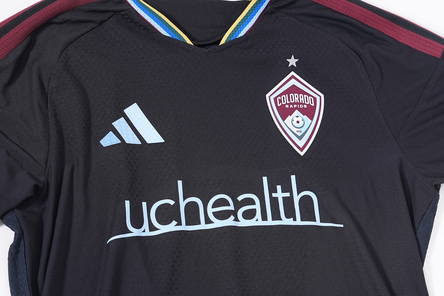
“When you look at our logo compared to all the other crests in MLS, it takes a minute to find it. That’s problematic. You hear the phrase forgotten franchise a lot.
Durmer said the color pallet could be changed. A different shade of Burgundy and/or Blue are possible. The outer shape of the crest is unique in MLS, but does not standout. Staff at the club admired the process and the result that New York City FC had in designing their crest and Seattle Sounders had in their “evolution” in 2023.
“Whatever we do will be incredibly us. Incredibly Rapids. That’s one of the things missing. Fans say if you look at our crest, there’s nothing that you see there that’s Colorado other than the word Colorado.”
Duane Brown from DNVR says all the time that the club does a great job of being Colorado. They haven’t done a good job of incorporating Rapids. The crest has mountains on it but where’s the water? Part of why the Headwaters kit was received so well is because “it was time for Rapids.”
There’s two routes they could go with: A more elaborate busy crest with symbols, Easter eggs, and meaning or a simplified look. For the former, think Inter Miami or New England Revolution. For the latter, think Seattle, Chicago Fire, or Arsenal with the alternate crest that’s just the cannon silhouette.
The fan survey was the first measurement. Fan involvement will be the second measurement in measure twice, cut once.
But what does it mean? And are the fans going to be involved?
“That narrative, the who we are is the first component. We need to figure out what that means to us so we can articulate that visually.” we want to know who we are. We’re reimagining the entire purpose of Rapids.”
Sports teams are supposed to represent a region but also stand for something. This change is an opportunity to assess the values of the club and the Rapids Community. Part of making a cool new crest is making clear who you are and make sure “every part of this crest has a story that connects back to this region,” as Durmer put it. To go back to the fan survey, does the Rapids crest signify party or battle?
“The identity. The native, the colors, and the crest. Does it mean forward movement? Does it mean pressure?”
Expect some open forums on this with larger fan input. The club liked how Seattle and NYCFC did that. Some of the smaller focus group rebrands didn’t go as well. See Columbus Crew.
“Don’t want this to just be a marketing ploy.”
That was one of the first reactions I saw when the fan survey came out. Fans thought the club is going to do a bunch of work to have a new crest, just to sell some merch, and have that paper over the cracks of unresolved systemic issues at the club.
“They don’t want this to just be a marketing ploy. It needs to come alongside with a visible change in how the club operates for it to mean something. That was green lit from an ownership, leadership standpoint. We (club staff) want that too.”
There have been some encouraging signs on the ownership front. The club reinvested transfer fees in the last two windows, signing Paxten Aaronson with the Djordje Mihailovic money. The Cole Bassett transfer was converted to GAM which was then used to buy Georgi Minoungou. Kevin Demoff is involved regularly in club operations in ways no KSE exec has been previously.
The fact that this reinvention/rebrand is so out in the open as the process is starting is a good sign. Other MLS teams have just done it. The goal of the fan survey was to find out if this was even viable. If it’s done with the right intentions and meaning behind it, this will be a success.
I understand the C38 geezer who is still waiting for the scoreboard to be updated. The fan who’s still mad the team didn’t fill the two open U22 slots. There’s still a valid question about all these moves and Demoff’s hands on approach leading to bigger change that is needed and circumstances that would happen at no other KSE property or MLS team.
Is this just low hanging fruit or a sign Stan finally cares and if he sees some results, he’ll write a bigger check for bigger changes? The scoreboard is the physical manifestation of ownership’s neglect of the club and its fans. Replacing that would convince a lot of people still skeptical of this rebrand.
“I can give you an update on the scoreboard. I’m working on it. There are meetings that are happening actively. A KSE wide conversation on this. Kevin (Demoff) is actively working on that.”
Timelines and fan experience updates:
Adidas and their production timelines are a significant factor here. The club will have a new secondary kit for the calendar changed 2027-28 seasons. That suggests there might not be a new kit launched for the 2027 shorted season. Makes sense. The replacement for the Headwaters kit is already in development.
Clubs have guidelines from Adidas on the kits, but have taken more freedom in recent years. They could be developing a new crest internally while at the same time working with the kit provider to finalize a new shirt. Timing those together could be tricky. The name and colors staying the same should make that easier.
Durmer says expect new kits and other merchandise to align with the reimagined crest starting in 2028-29.
There are some other updates on the fan experience side. Expect more merch catered to women after the World Cup break. There will be changes to some premium seating areas around July. That area will look a lot different. BW speculates that could be Summit Club. Two home games in, things are going well with the new local food vendors. Expect more good stuff on that front in 2027. Those will remain the same for this year with those contracts locked in.
Thank you for reading Burgundy Wave. Support us via our Patreon starting at $5/month. You can also make a one-time contribution via Tip Jar. We’re always looking for new talent. Let us know if you’re interested in covering Colorado Soccer.